

Showcase
Every image on this page is a baseline committed to the visual-testing repository. They are the images its own test suites compare against, taken on Linux in headless Chromium. Nothing is mocked up. The code next to each image comes from the story or spec that produced it, trimmed to the lines that matter.
The plan cards come from testcases/showcase, a test project made for this page. It uses a bundled
font and fixed colors, so its captures are the same on every run.
Automatic and manual snapshots
Section titled “Automatic and manual snapshots”With the auto preset, every test gets a snapshot without a line of snapshot code. When you want a
particular element under a name you choose, take a manual snapshot.
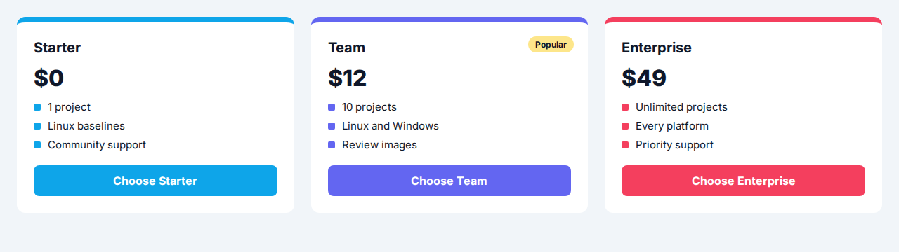
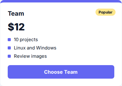
// Automatic: the test only renders. The `auto` preset captures the page afterwards.it('plan grid', async () => {  await render(<PlanGrid />)})
// Manual: pick the element and name the snapshot.it('team plan', async ({ expect }) => {  setAutoSnapshotOptions(false)  await render(<PlanGrid />)  await expect(page.getByTestId('plan-team')).toMatchImageSnapshot({ snapshotKey: 'team_plan' })})
See vis() and
expect().toMatchImageSnapshot().
Per-viewport snapshots
Section titled “Per-viewport snapshots”Resize the viewport inside a test and snapshot again, so each breakpoint of a responsive layout gets its own baseline.
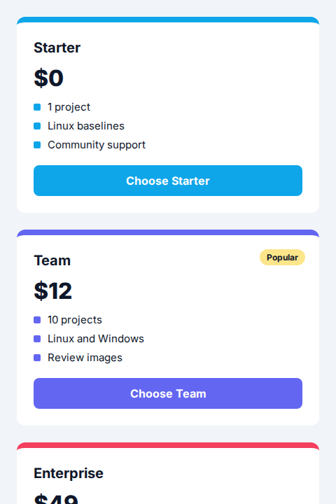
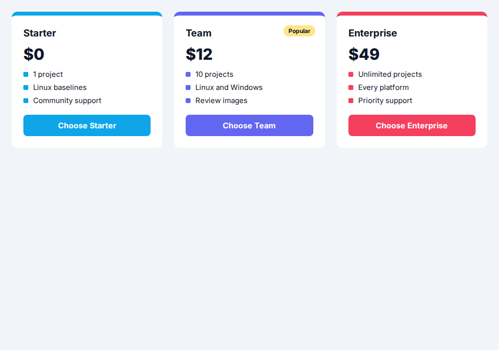
it('plan grid per viewport', async ({ expect }) => {  setAutoSnapshotOptions(false)  await render(<PlanGrid />)
  await page.viewport(480, 720)  await expect(document.body).toMatchImageSnapshot({ snapshotKey: 'phone' })
  await page.viewport(1024, 720)  await expect(document.body).toMatchImageSnapshot({ snapshotKey: 'desktop' })})
The body is styled to the viewport height with overflow: hidden, so each capture is exactly what
that viewport shows.
Automatic story snapshot
Section titled “Automatic story snapshot”A story tagged snapshot is captured without any test code. This repository sets the subject
option to [data-testid="subject"], so only that element is captured and unrelated content cannot
break the baseline.
The baseline holds the word “subject” and nothing else. The red “This will not be captured” line in the story is not part of it.

export default {  title: 'Auto Snapshot',  tags: ['snapshot'],} satisfies Meta
export const CaptureSubjectOnly: StoryObj = {  render: () => (    <div className="flex flex-col gap-2">      <div data-testid="subject">subject</div>      <div className="text-red-500">This will not be captured</div>    </div>  ),}
Every story with the tag gets a baseline, so coverage grows with your Storybook. See Automatic snapshots.
Per-theme snapshots
Section titled “Per-theme snapshots”One story produces one baseline per theme. These four come from the Primary and Secondary button
stories, captured once in light and once in dark.




A theme regression, such as a button that loses contrast in dark mode, shows up as a pixel difference in the matching baseline. You tell the addon how to switch theme, and it runs each story in both.
vis.setup({ auto: { light() { document.documentElement.classList.remove('dark') }, dark() { document.documentElement.classList.add('dark') }, },})See vis.setup().
Reviewing a failure
Section titled “Reviewing a failure”When a snapshot does not match, you get a diff of the whole image and a review image that crops each changed region, so you see what changed without comparing two screenshots by eye.
These images come from a real comparison. The baseline is the Team card. The result is the same card with a green button and the badge moved 40 pixels left.
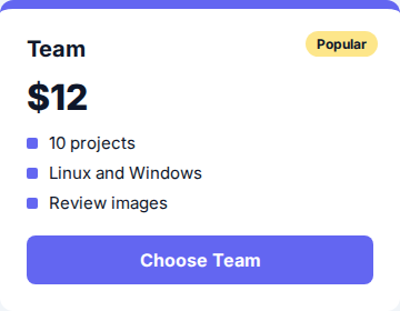
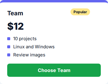
The failure message lists the changed regions and where the images are:
Snapshot `review-a-change` mismatched
Expected image to match but was differ by 14632 pixels.
Options:    failureThreshold: 0 pixels           comparisonMethod: pixel
Expected:   ./__vis__/linux/__baselines__/review.spec.tsx/review-a-change-before.pngActual:     ./__vis__/linux/__results__/review.spec.tsx/review-a-change-before.pngDifference: ./__vis__/linux/__diffs__/review.spec.tsx/review-a-change-before.pngChanged:    2 regions: 135x55 at (220,12), 344x76 at (8,196)Review:     ./__vis__/linux/__diffs__/review.spec.tsx/review-a-change-before.review.png (baseline, result, diff of each region)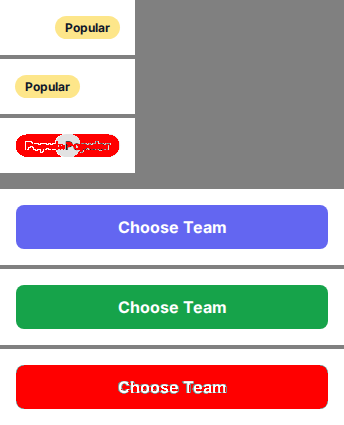
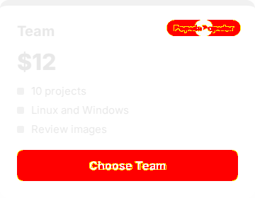
Open the review image first: it holds only the two regions that changed.
const screen = await render(<TeamCard />)const card = page.getByTestId('plan-team')await expect(card).toMatchImageSnapshot({ snapshotKey: 'before' })
await screen.rerender(<TeamCard buttonColor="#16a34a" badgeShift={40} />)// Fails, and writes the Difference and Review images listed in the message.await expect(card).toMatchImageSnapshot({ snapshotKey: 'before', expectToFail: true })
The test passes expectToFail so the repository’s CI does not fail on purpose, and then keeps the
two images as baselines. See
reviewImage
and Reviewing failures with agents.
Snapshot thresholds
Section titled “Snapshot thresholds”A small rendering difference does not have to fail a test. failureThreshold sets how many pixels
may differ before the match fails. The unit is pixels by default, and a percentage is also supported.
Both threshold stories share one baseline, threshold, which is shown below. It is a stored baseline,
not the output of a failed run. The stories render slightly different text (“unit text”) from the
baseline (“unit test”), so the comparison finds a few differing pixels. A threshold of 70 pixels
accepts them. A threshold of 20 pixels rejects them.

// Passes: the differing pixels are within 70.await expect(subject).toMatchImageSnapshot({  snapshotKey: 'threshold',  failureThreshold: 70,})
// Fails: the differing pixels exceed 20.await expect(subject).toMatchImageSnapshot({  snapshotKey: 'threshold',  failureThreshold: 20,})
See expect().toMatchImageSnapshot().
Elements, locators and images
Section titled “Elements, locators and images”toMatchImageSnapshot() accepts a Vitest browser locator, a DOM element, or an image encoded as a
base64 string. Use whichever your test already has in hand.



The locator and the element point at the same markup, so their baselines are identical. That is the point: the subject type changes how you write the assertion, not what is captured.
const subject = page.getByTestId('subject')
await expect(subject).toMatchImageSnapshot()await expect(subject.element()).toMatchImageSnapshot()await expect(UNI_PNG_BASE64).toMatchImageSnapshot()